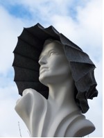
The beautiful man

The beautiful man

Thursday, 27 January 2011

Diploma presentation finished!!

My display 

Got to Manchester at 8am ready to set up the diploma stage  display,  treing to keep calm and not be too over zealous with putting work up.  (not doing a recruitment throwing s**t at the wall and hoping it will stick) thanks to Fiona, Polly, Sarah and Jane for ensuring I didn't.

Needlewoman
My work was two exhibition proposals. No1: Needlewoman based on the Engels book and in particular the plight of the young girls involved in the lacemaking, millinery, shirtmaking and other garment manufacture. I hope that I created something to make people look again. It has generated a lot of ideas as to where i could take this idea into further work, whcih is exciting.

Accessory   
No 2: Working around the idea that accessories could generate narrative and question what it is that we are seeing or presenting to someone. So I photographed all my shoes, and gave them factual labels: looking at the idea of who denotes the values of objects. Photographs of Chesil Beach detritus, look sinister and using the perspex box to enclose the hat and bag with a range of definitions questions the notion of value further and hopefully makes people question what they see and what they are tld that they see.

So now fingers crossed I have passed and on to the last stage of the MA next deadline September 1st...

Sunday, 23 January 2011

Foray into Fine Art

After posting the excerpt from the Engels' book on the Working Class in Manchester in 1840's their plight and the circumstances of the lives of the needlewomen has been going round in my head. When i began the MA I felt very stuck as to how to express thoughts and ideas within work, I still am unsure so here are a few of my risks, constructive feedback most welcome, just be kind.........

The needlewomen would work a minimum of 15 hours a day, in busy times or less scrupulous workrooms they would have just 2 hours sleep a night. Working in poor light and in cramped conditions they often died young. I threaded the needles in the evening with a low light and no glasses.

Five hours from this to this......

I realise that the glove nods its existance to the Susie Macmurray Widow dress, which made me question whether it was appropriate to attempt. Having watched the Glasgow Boys documentary on BBC4 last night (highly recommend it) one sees that artists have always evolved from seeing others' work and often mimicking or taking another's technique as a means to try new working practice, is this any different. Also I want to pose questions with the work so questioning authenticity and value is as important as whether the work has resonance. We shall see presentation only 4 days away! I think i need to add pins to the back of the hand too though.

Thursday, 20 January 2011

Hat display

I have just taken down the hats from the first year students' display so felt it would be good to record the event on the blog and its often easier to critique from images than in reality as I tend to see the components as opposed to the overall form and effect. Using the dummies was purely serendipitous as they were there from displaying a series of tweed garments. We haven't used dummies before for the hats, just normally plinths and heads in the cube space, which fits to a standard display format. Unsure if you will look more closely if the pieces are displayed as above or whether in actual fact using the perspex vitrines in the Summer really made closer examination as you could get close and in context our systems inform us that the item will be precious therefore warrant our attention. Though I think this is far to simplistic and the way to assess whether dynamic displays are dynamic would be to try many different styles and approaches and gain feedback.

Shoe tree  
Bags of dreams

Friday, 14 January 2011

Diaghilev at the V&A

I was looking forward to the exhibition as the reviews have been so good, though my MA tutor had suggested that the curating wasn't as strong as they had hoped. As it was the last weekend it was very busy and there were queues for everything, which is never a great way to start ones sense of wonder!

The exhibition was vast, it felt like a much bigger space than the quilt even though it mustn't have been. I walked past the first bit as it was so full of people I felt quite claustrophobic. So my first 'case' was one with a top hat, opera glasses and a cape this had a resonance and the sparseness of the placing was good. The early costumes were fascinating as they seemed so basic and not the polish that we think we see when we see film or theatre now. There was a myriad of textile techniques used from ikat, applique and embroidery and a real vibrancy in them. The first set where they were turning round slowly in the centre was very fitting and enabled the whole of the costume to be viewed. I loved the Poiret pieces they were sumptuous and didn't seem dated. Also my knowledge wasn't that strong on Diaghilev so I knew of the Poiret connection and the Picasso but that was it really.
The backdrops were stunning the scale and drama was really brought home in the space especially after feeling that much more contained in the other parts of the exhibition, suddenly one felt as if on the stage, both with the Picasso and the houses backdrop. I think these were some of my favourite pieces. Also the case with ballet shoes in against a spattered painted board, the look of hard work, stories untold and promises kept and broken.
It was an immense exhibition and so much for so many people, with music, choreography, history, art, textiles, theatre, even celebrity with the wonders of the great dinner party and scandal with Nijinsky. So as far as achieving aims of engagement and education and inspiring awe it did these most successfully. I did feel overwhelmed though and would have liked a break or a map to point out the key parts of the show, I could understand people visiting more than once. I felt I couldn't do justice to the pieces there, so i would have liked to spend more time looking at the costume illustrations and the paintings of the 20s etc but it was so busy. Which in reality is fantastic for the V&A as they have produced a ground breaking successful show again, bt for me there was a little missing.


Wednesday, 12 January 2011

Phew

Competed the written work for the second stage of the MA hurrah, not sure if it will meet all expectations but its given me the information that I need to move to develop my MA practice in the final stage, fingers crossed I pass this one.

Sunday, 9 January 2011

30 Years of Japanese Fashion

I had been hoping to make it to the Barbican before this closed and thankfully did and had delightful company (thanks Ags) too, who was inciteful, critical and had some great new ideas. Again no photos...just the £35 book to buy which was a shame, as it is such a big exhibition with so much happening and things that have been brought together that you wouldn't normally see that you need to be able to reflect again afterwards.

Illicit photos were taken.

It is a huge space and it was well designed in many respects to get across the exquisiteness of the work. I would have liked to have had more references of what the 80's fashion that the Japanese aesthetic was so far removed from was like. I obviously remember it well yet for someone in their twenties I think it is harder to fully grasp how truly revolutionary and visionary the designers were, and personally I feel that this hasn't happened again. The exciting designers that have come to the fore since this movement began their work is definitely influenced by it. The wooden Yohji Yamamoto dress that was at the Royal Academy so like the work that Hussein Chalayan has since pioneered.

I love these clothes they have a fantastic resonance in the use of fabrics, shapes, forms, questioning the normal way of wearing and what clothes can be. Rei Kawakubo's work is thrilling the interview piece is fascinating she has such composure and her own unique take on the industry that she is in, as she was from a fine art background and then worked in advertising so she creates answers to different questions.

 
Comme des Garcons


Alexander McQueen window
 Slight similarity of the two jackets....

Issy Miyake

This was one of the more directional parts of the exhibition in laying the garment on the floor in front of the mannequin to gain some understanding of the fact that often you will look at the piece and have no comprehension of how to wear it, it also eloquently showed the origami processes that lead to the stunning forms on the models.


A tremendous retrospective exhibition which is highly effective in showing how a group can transform fashion and the way we think of garments and colour or the lack of it so thoroughly.

Questions that arose as to the curation of the exhibition- why always shop dummys to display garments I realise that the clothes have to be displayed in a certain way to show how they would form around the body and for fashion students it is good to be able to look closely at the detail, and yet sometimes it feels a little like walking round a department store, even if it s full of exquisite things. How else could the pieces be looked at?

The first section is called 'In Praise of Shadows' Really strong collection of garments and from a range of designers yet I would have liked the use of the shadow of the garment to have been used more especially in the Junya Watanabe pieces. Ags mentioned that in the John Pawson exhibition at the Design Museum there were samples of the materials he had used in the constructions to touch and gain a sensory understanding of the work, this would have been great with the Watanabe piece and a few of the others. Unsure how best to do this so that it still fitted with the aesthete of the exhibition and the garment without looking untoward.


Designer Show Catalogues
There were a lot of the showbooks from the designers around the exhibition in angled glass boxes one wanted to be able to turn the pages and with the advent of powerbooks etc it would be more interactive and informative to be able to switch the pages over to gain a full breadth of what the designer was doing at the time.

Stunning exhibition and book which I will need to put on my  birthday list!
And this......

Aware: Art Fashion Indentity

Meschak Gaba
Exhibition at Royal Academy but actually display as Haunch of Venison round the corner. Really excited to see this exhibition and it didn't disappoint from the opening view of the Grayson Perry coat as you climbed the stairs, and the stunning Helen Storey dissolving dress to artists that I hadn't heard of but all made me think and nearly all were valid inclusions in this well ordered and inciteful exhibition.

The Meschak Gaba head pieces in the room where I had only recently seen the Polly Morgan Psychopomps were really captivating the use of traditional weaving techniques with fake hair and taking these forms into traditional African head wrap styles was fascinating and I really enjoyed the display form.
The Helen Storey dissolving dress made strong reference to the fact that we need to rethink how we produce and use clothing yet in its form looked as a beautiful piece of art or theatre as the dress was lost into the pool of seaweed water.
I had seen the Susie Macmurray piece Widow at Platt Hall, in the Haunch of Venison it took on an even more beautiful glow and stature; though still in a mansion house setting it had a lot more space around it to weave its spell and the lighting made it shimmer and shine making the starkness of the needles more vibrant when looked at closely.

Sadly I have no more photos as I was then told not to take photographs. I am quite happy to follow such guidelines, (though there were no signs up) if there is the opportunity afterwards to buy a catalogue or images. I thoroughly understand the need not to project an artists identity with bad images etc etc but I feel this needs a rethink as there is often the need for an aide memoire and many museums you sign a photography disclosure form to ensure that they are for educational purpose only. So I wrote lots of notes.

Things I really loved - the Dai Rees -Carapace Tryptych:The Butchers Window 2003, using 1950's vintage Vogue patterns and creating leather 'garments' that resemble carcasses. Beautifully curated space. Andrea Zittel A-Z Fibre Form Uniforms 2003-06 hand made felt done exquisitely; Gillian Wearings film of policeman sitting for a photograph really subtle and enlightening. The Yoko Ono and Marina Abramovic's pieces from the 60's and 70's performance art were really poignant and relevant as was the Cindy Sherman Doll's Clothes.

Well worth a visit and the £5 entrance fee. The space at the Haunch of Venison is superbly used and allows you to  see all the pieces effectively without them crowding each other.